
You send a logo to a client. On your screen, it’s a vibrant electric blue. On their laptop, it looks like a muddy navy. You print a brochure, and the skin tones come out green. Sound familiar? This isn’t bad luck; it’s a breakdown in color profiles and a lack of proper font organization. Most designers focus on aesthetics but neglect the technical plumbing that keeps their work consistent across devices. If you want your designs to look exactly as you intended, from the monitor to the press, you need to master two specific areas: managing your typefaces and controlling how colors are interpreted.
Why Your Screen Lies to You
Every device sees color differently. Your iPhone uses an OLED panel with wide gamut coverage. Your office monitor might be an older IPS panel with limited sRGB support. The printer in your basement uses CMYK ink. Without a translator between these devices, colors shift. That translator is the ICC profile (International Color Consortium profile). Think of an ICC profile as a dictionary. It tells your computer, "When I say 'Red' in my language, translate it to this specific mix of light waves for your screen." If you don't have the right dictionary installed, or if you ignore it, your computer guesses. And usually, it guesses wrong.
The most common mistake? Working directly in RGB when you plan to print. Or worse, working in CMYK without knowing which press profile applies. In 2026, standard workflows still rely heavily on Adobe Creative Cloud tools, where Adobe Color Settings control how these translations happen. If you leave these settings at default, you’re letting Adobe make decisions for you based on generic assumptions, not your specific hardware.
Taming the Font Chaos
Let’s talk about text. How many times have you opened an old project file only to see a warning box screaming that fonts are missing? It’s frustrating. It breaks layout. It forces you to guess which weight was used. Effective font management is about creating a single source of truth.
Stop installing every free font you find into your system library. Your operating system slows down when it has thousands of fonts active. More importantly, version conflicts arise. Did you use Helvetica Neue or Arial? They look similar, but they aren’t the same. Using a dedicated manager helps you group fonts by project or client. Tools like FontBase or RightFont allow you to activate fonts only when you need them. When you close the project, you deactivate the fonts. This keeps your system clean and prevents accidental substitutions.
- Organize by Client: Create folders for each major client. Only activate those fonts when working on their files.
- Version Control: Keep old versions of brand fonts archived. If a client updates their logo in 2024, you still need the 2020 version for legacy materials.
- Check Licensing: Ensure you have commercial licenses for all activated fonts. Font managers often track license status, saving you legal headaches later.

Setting Up Your Color Engine
Now, let’s fix the color issue. You need to configure your software to respect profiles. In Photoshop, Illustrator, and InDesign, go to Edit > Color Settings. This is the command center. Here, you define three critical things:
- Working Spaces: What color space do you create in? Use sRGB for web and digital design. It’s the universal standard. For print, use CMYK, specifically a profile provided by your local printer. Don’t guess. Ask your print shop for their .icc file.
- Color Management Policies: Set this to "Preserve Embedded Profiles." This ensures that if someone sends you a file with a weird color space, your software doesn’t automatically convert it and mess up the colors. Instead, it flags it so you can decide what to do.
- Conversion Options: Choose "Perceptual" for photos. It compresses the color range smoothly. Choose "Relative Colorimetric" for logos and solid colors. It preserves exact color values, which is crucial for brand consistency.
| Scenario | Recommended Profile | Why? |
|---|---|---|
| Web & Mobile UI | sRGB IEC61966-2.1 | Universal compatibility across browsers and devices. |
| High-End Print | Printer-specific ICC (e.g., GRACoL) | Matches the specific ink and paper combination. |
| Photography Editing | Adobe RGB (1998) | Wider gamut than sRGB, good for high-quality prints. |
| Cross-Platform Exchange | Embedded Source Profile | Prevents unwanted conversion during file transfer. |
The Proofing Trap
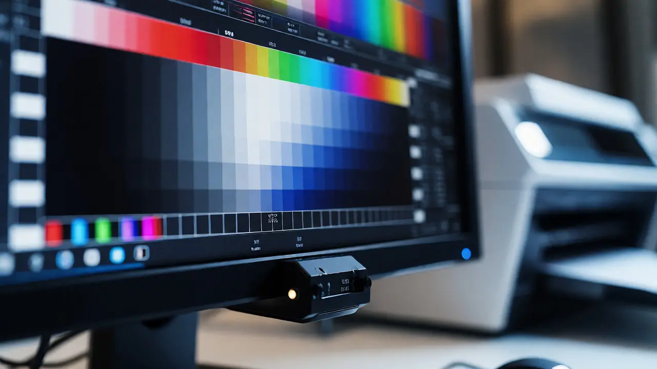
You’ve set up your profiles. You’ve organized your fonts. But how do you know it will look right on paper? You can’t trust your monitor alone. Even calibrated monitors drift over time. You need proofing. Most designers skip this step to save money, then pay double when the first print run comes out wrong.
Use soft proofing in Photoshop (View > Proof Colors). This simulates how your image will look when printed on specific paper using a specific ink. It’s not perfect, but it catches major errors. Look for out-of-gamut warnings-areas where your screen shows a color that the printer physically cannot produce. Usually, these are bright cyans or neon greens. Adjust them before you hit send.
For fonts, proofing means checking legibility. Does that thin serif font disappear when printed on uncoated stock? Uncoated paper absorbs ink, causing letters to spread slightly (dot gain). A 6pt font might look crisp on screen but illegible in print. Always test-print a page with different font sizes and weights before committing to a full run.
Automating the Workflow
Manual checks are error-prone. You forget to embed fonts. You forget to flatten transparency. Automation helps. Use actions in Photoshop to batch-process images. Create an action that converts images to sRGB, resizes them for web, and saves them as JPEGs with specific quality settings. Run it on a folder of 50 images in seconds.
For fonts, consider cloud-based solutions. Adobe Fonts syncs directly with Creative Cloud apps. When you install a font via Adobe Fonts, it becomes available instantly in all your Adobe apps. No manual installation. No version conflicts. It also handles licensing automatically within your subscription. This is the modern way to manage typography without cluttering your hard drive.
Troubleshooting Common Disasters
Even with a perfect setup, things break. Here’s how to fix the usual suspects:
- Colors look washed out in PDF: You probably flattened layers incorrectly or didn’t embed the profile. Check your PDF export settings. Ensure "Output Preview" is on to see if colors shift during export.
- Fonts replaced with Courier: This happens when the font is missing or corrupted. Open the file, go to Type > Find/Replace Font. Replace the missing font with a known substitute temporarily to see the layout, then locate the original file.
- Black text looks gray: You likely used "Rich Black" (C60 M40 Y40 K100) instead of "Pure Black" (K100). For small text, always use K100. Rich black is meant for large backgrounds. Small rich black text suffers from registration issues, making it look blurry or grayish.
Mastering these technical aspects frees you to focus on creativity. When you know your fonts won’t vanish and your blues won’t turn purple, you stop worrying about the tech and start designing better work. It takes an hour to set up correctly, but it saves hours of rework every month.
Do I need to calibrate my monitor for color accuracy?
Yes, absolutely. Calibration creates a custom ICC profile for your specific monitor. Without it, your screen might display colors too warm, too cool, or with incorrect brightness. Hardware calibrators like X-Rite i1Display or Datacolor Spyder are recommended for professional work. Software-only calibration is rarely accurate enough for print production.
What is the difference between RGB and CMYK?
RGB (Red, Green, Blue) is an additive color model used for screens. It starts with black and adds light to create colors. CMYK (Cyan, Magenta, Yellow, Key/Black) is a subtractive model used for printing. It starts with white paper and subtracts light by adding ink. You cannot convert RGB to CMYK perfectly because screens can display colors that printers cannot reproduce (out-of-gamut colors).
Should I outline fonts before sending files to a printer?
It depends on the file format. For PDFs, embedding fonts is usually sufficient and preferred because it keeps the text selectable and searchable. Outlining fonts (converting text to shapes) is necessary for AI/EPS files sent to vendors who might not have your fonts. However, outlining removes kerning adjustments, so check spacing carefully after converting.
How do I handle spot colors vs process colors?
Spot colors (like Pantone) are pre-mixed inks used for brand consistency. Process colors (CMYK) are mixed from four inks. Use spot colors for logos and critical brand elements where exact color matching is vital. Use process colors for photographs and complex gradients. Never mix spot and process colors in the same element unless you understand overprinting rules.
Can I use web fonts in print designs?
Technically, yes, if you have the desktop license. Web fonts are optimized for screen rendering (hinting), which can sometimes look jagged in print if not properly outlined or rasterized. Always check the license agreement. Many web fonts require separate desktop licenses for print usage. Verify that the font supports the special characters or languages needed for your print piece.